Content begins here
Main page content
Click to collapse
Order and readability are better than beautiful
Objectives
In this lesson, we will learn and understand the use of drawing within narrative dynamics.
Order and legibility are better than beauty
Aesthetic research in comics should always be considered secondary to the narrative function. Some technical considerations on drawing The word drawing encompasses a large number of activities, ranging from the world of fine arts to engineering. Each with its own peculiarities. Let us discover those of the comic strip.
Some technical considerations on drawing
The word drawing encompasses a large number of activities, ranging from the world of fine arts to engineering. Each with its own peculiarities. Let us discover those of the comic strip.
Pencil drawing and pen drawing
The pencil's light, modulated mark is unmistakable, but what makes it unique is the possibility of eliminating marks. Before it, charcoals were used, which were even more volatile than the wood and graphite pencil. The pen, in its ancient incarnation with a metal tip dipped in ink, was often used by artists of the past. Leonardo's codices with the magnificent drawings of his designs are made with the same pen with which the texts are written.
Pencil and pen in comics
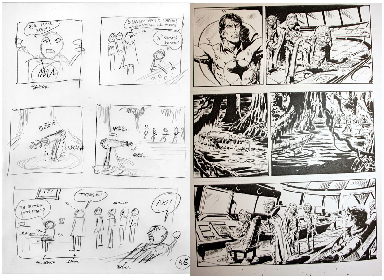
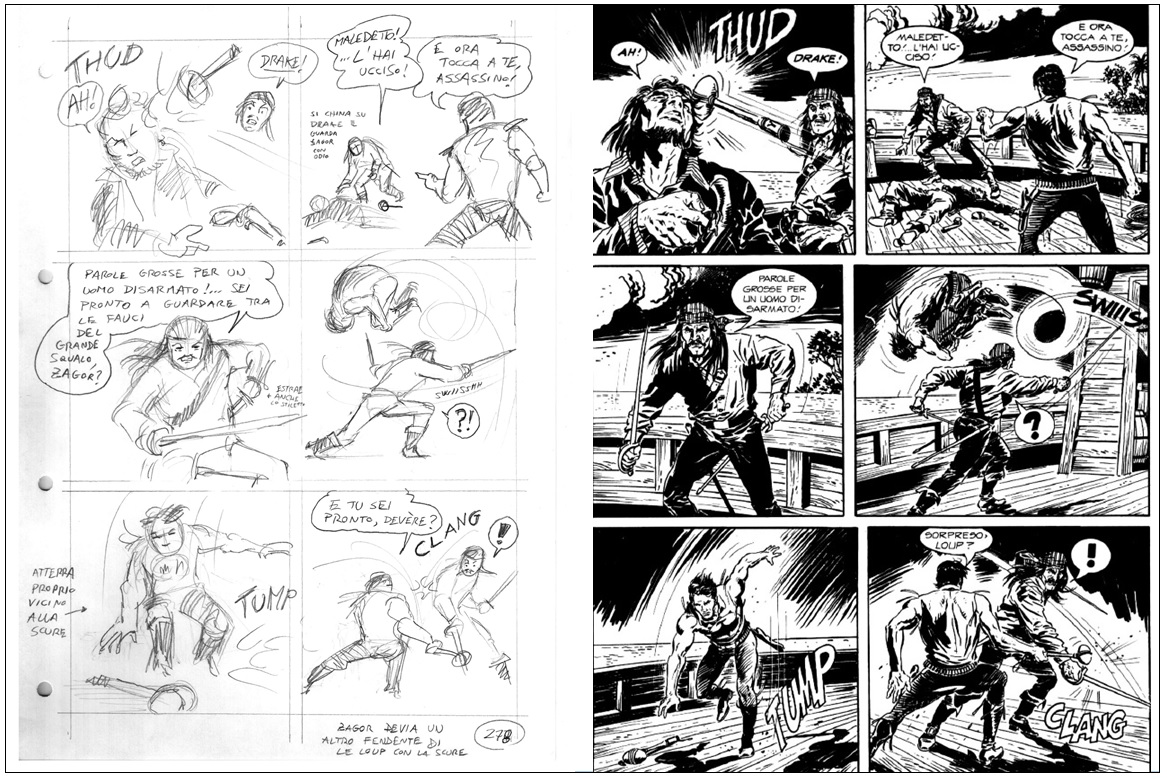
These two means of expression have met in the world of comics, becoming complementary, as well as indicative of two technical steps in the creation of drawings. For technical reasons, the pencil drawing was too light to be reproduced by the old printing technologies, so they resorted to pencilling.
With an eye on the final appearance
The pencil is erased after pencilling. Unless it is done on another sheet of lighter paper, taking advantage of its transparency, or with a light plane, the pencil drawing is temporary. The pencil drawing is in practice the basis for the pen, which has a clean, clear mark.
A few words about visual perception
Drawing is like organising objects on the desk, the tidier we are, the easier it is to see what is on the desk... And nothing is likely to disappear hidden by something else.
Less is more
The synthesis. Simplifying the elements of an object to find a simpler form that represents them is a fundamental. Synthesis is advisable because on thosen drawings the eye passes by, it does not linger. Images that are to be read should not be conceived as pictures to be observed for a long time, even when drawing a scene to describe an environment suggestion is much more effective than slavish representation. Evoking an environment rather than faithfully reproducing it leaves more room for the reader's imagination.
On symmetry and asymmetry
Symmetry is one of the principles that have governed the visual arts since ancient times. Linked to a concept of harmony, order and regularity. It has a drawback: it risks making drawings static. Asymmetries, on the other hand, are more dynamic, more natural. As a consequence, asymmetries are more complex to manage. Using excessively asymmetrical compositions can lead to visual messes, which is
why they must be handled with care.
The composition
The comic strip follows the reading order. Everything must be arranged in the panel, bearing in mind that the eye will first look up to the left and then down to the right following an imaginary diagonal. Conditioning this natural movement of the reader's eye requires skill. However, there is a structure known as the two-thirds rule (used extensively in photography) which can help the draughtsman understand and guide the movement of the eye.
Everything has the right space
In order to give the right emphasis to the drawn elements, one must remember that there is a kind of panel hierarchy.
Inside the frame
Unlike photography or cinema, framing in comics is inclusive rather than exclusive. The pencil of the artist pays attention to what will be present in the frame, unlike the lens of a camera which tends to exclude. Every element in the panel is narrative, nothing can be placed at random otherwise the viewer's eye risks stopping or getting confused. No doubt there are more important elements and others less so, but nothing must be left to chance.
Don't forget the 'weight' of the texts.
A recommendation that is never superfluous is to calculate the 'weight' of the texts as part of the composition. The rhythm and visual harmony must consider the balloons and the visual mass of the texts as an integral part. For this reason the texts must be proportioned as a quantity so that the design welcomes it rather than rejecting it as a foreign body.
Conclusions
For this reason the texts must be proportioned as a quantity so that the design welcomes it rather than rejecting it as a foreign body.
Video and PDF presentationClick to collapse
The following video explains the content of this lesson and shows some examples:
Video T3.L1. Start to draw in details
Here you have the content of the video in pdf in case you need to use it in your classroom:
Pill T3.L1. ExamplesClick to collapse
Pill T3.L1. Examples
In this video some examples of comics about cultural heritage are shown:
Lesson contents in PDFClick to collapse
Here you have the contents of the lesson in PDF: